
Choosing warm paint colours for north-facing living rooms
Why north-facing rooms feel cold in the first place
North light is indirect, even and beautifully consistent — but it is also cooler in tone than light from any other direction. There is no warm afternoon sun bouncing off the walls, so any hint of blue or grey in your paint becomes more pronounced, shadows sit deeper, and a room that looked soft and inviting in the shop can turn decidedly chilly once it is up on all four walls.
The good news is that this is a predictable problem, which means it is a solvable one. You are not trying to banish the cool light; you are choosing colours with enough warmth in their base to meet that light halfway. Get the undertone right and a north-facing living room can feel calm, cocooning and genuinely cosy — the sort of room you gravitate towards on a wet Tuesday in February.
Undertones matter far more than the name on the tin
Ignore the poetic names for a moment and look at what sits beneath the colour. Every neutral leans somewhere: yellow, red, orange, green, blue or violet. In a north-facing room you want to lean towards the warm end of that spectrum.
- Look for: yellow-based creams, soft greige, oatmeal, stone, mushroom, pale blush and warm off-whites.
- Approach with caution: blue-based greys, icy whites, lavender-leaning neutrals and anything described as "cool" or "arctic".
- Avoid entirely: brilliant white. It reads grey and institutional in low light, and it makes every other colour in the room look duller by comparison.
It also helps to think about light reflectance value — how much light a colour bounces back. Mid to high values keep a dim room feeling open, but a mid-tone wall that is genuinely warm often works better than a very pale one, because it holds the shadows gracefully instead of fighting them.
Always test before you commit. Paint large patches — A3 size at minimum — in two coats on at least two walls, then look at them at 8am, at midday, at 7pm and again at night with the lamps on. North light shifts noticeably through the day, and a colour that looks perfect at noon can look grey by teatime.
Soft greys that stay warm
Grey is not off the menu, it just needs careful handling. The warm end of the grey family — greige, mushroom, pebble, warm stone — has a brown or green undertone that stops it turning cold. These shades feel sophisticated in low light and sit happily alongside natural wood, linen and wool.
If you want a room with real depth, try a mid-tone warm grey on all four walls rather than a pale one, and keep the ceiling and woodwork a warm off-white. Deeper walls in a small, dim room can feel enveloping rather than cramped, because the eye reads the consistency rather than the shade.
Warm whites, done properly
Warm white is the workhorse of the north-facing room, but it has to be chosen with care. Look for off-whites with a touch of yellow, almond or the palest pink — chalky, soft and never stark.
- Walls: a warm off-white or pale oatmeal gives you a clean canvas without the chill.
- Ceilings: use the same warm white, or a 50% tint of your wall colour. A white ceiling in a cool room simply looks grey.
- Woodwork: keep skirting and architraves in the same warm family, in a slightly harder-wearing finish. Stark white trim against warm walls creates a hard, graphic edge that fights the softness you are after.
Gentle greens for a calm, grounded feel
Greens are quietly brilliant in north-facing rooms. Because green sits in the middle of the spectrum, it neither amplifies the blue in the light nor clashes with it — it simply settles. Think sage, soft olive, eucalyptus, muted moss and dusky grey-green.
A mid-tone sage or olive across all walls is one of the most forgiving choices you can make: it looks rich in the evening, soft in the morning, and it flatters warm wood, brass, terracotta and cream upholstery alike. Steer clear of mint, lime and anything acid-bright — in low light they turn sour and slightly sickly. If you want to be bolder, a deeper forest green on a chimney breast or the wall behind the sofa adds drama without darkening the whole room.
Finishes, light and the finishing touches
Colour is only half the job. Finish changes how much light a wall gives back, so choose a flat matt emulsion for walls to soften imperfections, and a low-sheen eggshell for woodwork. In a very dim room, a washable matt with the faintest sheen bounces a little more light around without looking shiny.
Then layer in warmth at eye level:
- Swap cool white bulbs for warm ones around 2700K, and use two or three lamps rather than one overhead light.
- Add a mirror opposite the window to double the daylight, and keep windowsills and curtains clear of heavy clutter.
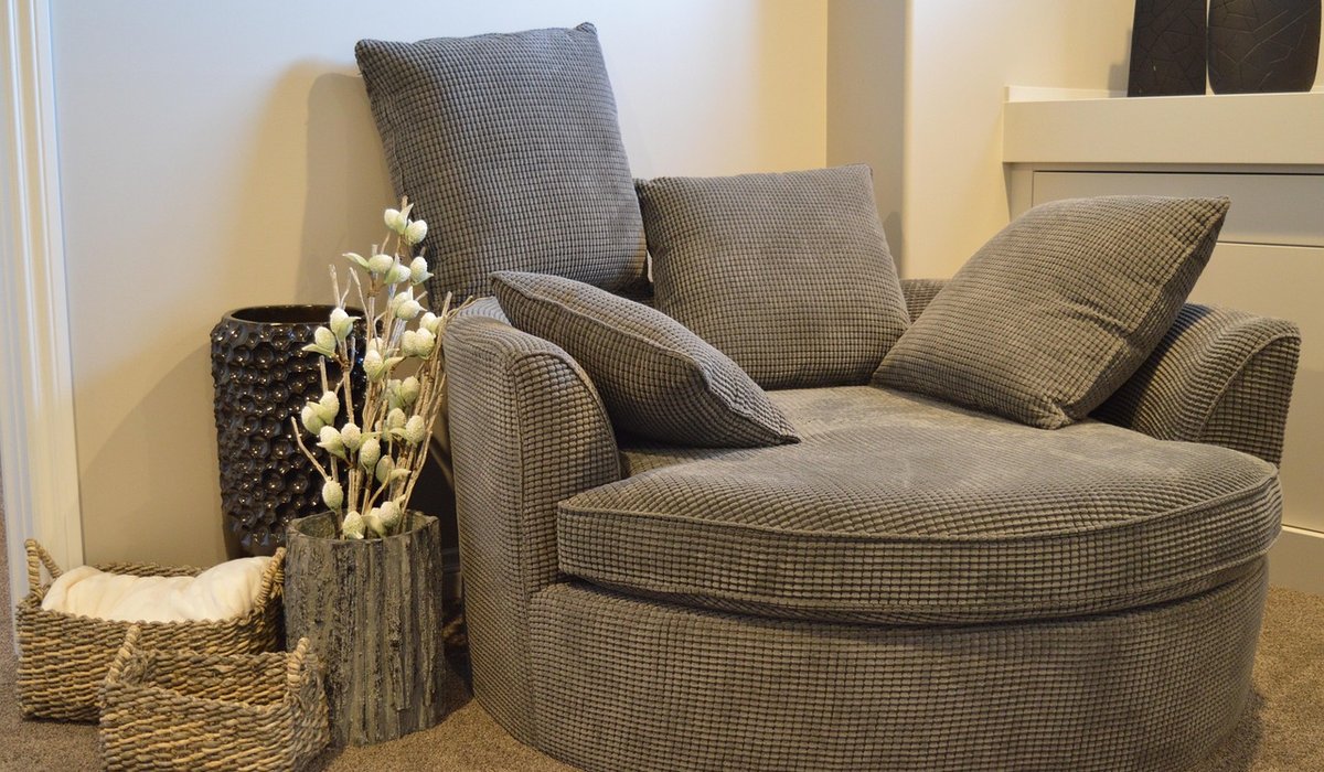
- Bring in texture — wool throws, linen curtains, a chunky bouclé armchair, a jute rug — because softness reads as warmth even when the light is cool.
- Choose warm-toned woods such as oak, walnut or reclaimed pine over grey-washed finishes.
Get those layers right and a north-facing living room stops being the room you avoid. It becomes the one you retreat to — gentle, quiet and warm, whatever the weather is doing outside.

4 Comments